Designing for mobile…it’s a hot topic because how and where people interact with email has changed. Today we are checking our email on mobile devices like smartphones and iPads while waiting in line at the bank or at the local espresso stand. We’re even checking email while at our kids’ soccer games, and–let’s be honest–during dull meetings too. The point is, we aren’t always at our desktops any longer, meaning you can’t be sure where your customer will be when they first see your email.
That means you might be taking mobile rendering into account when designing. I say “might” because it does depend on your audience. If your research indicates that your audience is still primarily checking email at a computer—and many Americans still are—then continue to design for that majority first, and mobile second. If, however, you have a significant portion of your audience checking email on mobile devices, then designing for mobile is imperative. (If you’re not sure and you’re not able to conduct the research yourself to find out, contact an email marketing vendor for help. This is information you need to know.)
Designing for mobile marketing is a challenge because of the number and variety of devices used. This variety has to be taken into account from the very beginning.
For some marketers, that means choosing between fluid and responsive design, both of which can help to render emails successfully on a wider range of mobile devices. How do you know which to choose, however? We turned to ClickMail’s Director of Creative Services Jared LaRock for his insight into the pros and cons of these two options.
Fluid
Fluid design (also known as fixed) is aptly named. In essence, a fluid email design “fills” the whole screen on a mobile device, whether that’s the tiny 240-pixel-wide size screen of a Blackberry Bold or the over-sized monitor of a desktop computer. The “fixed” part allows you to specify a maximum width for the desktop version. Fluid design does not target specific devices rather a max width for small screens using an @media query. The design fills the whole 100% of the space, whatever that space might be. The downside is fluid requires forgiving design. You can’t set design elements exactly, so your paragraphs might wrap in a weird place and your image size can be tricky, for example.
You might call this option both fixed and fluid because it uses a fixed width for desktops (600 pixels), yet it uses a responsive @media query to target an average phone screen. Let’s say the iPhone size is the target to go for. Anything bigger than the iPhone screen would get the fixed width and everything smaller will adjust to “fluid 100%.”
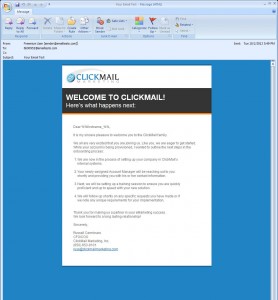
The three screen shots you see show how our welcome email renders using fluid design on a desktop in Outlook, on a Droid, and on an iPhone. We’ve designed the email once, and leave it up to the fluid approach to fill screen spaces.
Responsive
If you can’t leave design up to chance and you must design for specific mobile devices and screen sizes, you can with responsive design. Responsive design uses an @media query to deliver the right screen size to each device. Your coding would say, for example, “If the device is X wide, deliver this Y design.” The plus side to this is each recipient gets an email sized exactly for their device, be it a desktop or smartphone…or both. They get an optimum experience every time on every device. Responsive design also lets you hide nonspecific elements for a better mobile experience.
This approach does give you more flexibility but it is always best to try to simplify the design and content, Jared points out. The downside is the time it takes to do the coding, because you must code specifically with this in mind from the beginning. And that might not make economic sense.
Say only 2% of your list is viewing your emails on a Blackberry Bold that only has a screen size of 240 pixels wide. How much time should you or your email marketing vendor invest in coding for just that device compared to the 24% who are viewing your emails on a Droid, or the 53% who see your emails on a regular computer screen using Outlook? Is the time spent worth it to serve the significantly smaller audience? Responsive design gives you total control over how your emails render while fluid does not. But it takes much more time to do…and might not be worth it.
At a minimum you should be designing as “mobile aware,” says Jared. This approach should be a must in today’s market with all the devices out there as it is becoming more and more the norm. Being “mobile aware” means designing your emails as best you can knowing that they may be viewed on a small screen. At the very least, you should:
- Design for one column.
- Keep your main message in the left top corner with the call to action.
- Use larger font sizes and bigger buttons that are touchable.
- And always test, test, test.
Whether you choose one or other, Jared says both fluid and responsive designing require upfront planning and a collaborative effort unlike what we’ve done in the past. Now as marketers, we must be thinking coding and design at the same time because they have to work together. Gone are the days when a designer came up with a concept and handed it over to the coder to make it happen. Now the one doing the design and the one writing the code must work hand in hand.
Whether they work hand in hand on a fluid or responsive approach depends on your choice.


